Available for collaboration.
CV available upon request.
Leaked Signals
,
Cover
,
2022
Context: First SKAN Records compilation is featuring electro and breakbeat music straight out of the Polish underground. VA Leaked Signals Compilation gathers 7 artists touching on electro, breakbeat and acid across eight powerful tracks. Outcome: Since the label's first release, the visual identity of SKAN Records has been built around matrix-like graphic codes. Dynamic compositions and bold colors capture the raw and industrial energy of electro music, creating a system that feels as rhythmic and uncompromising as the sound itself. Graphic design: Dawid Koruszowic
01 / LABEL LOGO

02 / PLAYLIST COVER

03 / ALBUM COVER

04 / SPOTIFY
05 / STORIES
06 / COVER ANIMATION

07 / ASSET

08 / SPOTIFY
Leaked Signals
,
Cover
,
2022
Context: First SKAN Records compilation is featuring electro and breakbeat music straight out of the Polish underground. VA Leaked Signals Compilation gathers 7 artists touching on electro, breakbeat and acid across eight powerful tracks. Outcome: Since the label's first release, the visual identity of SKAN Records has been built around matrix-like graphic codes. Dynamic compositions and bold colors capture the raw and industrial energy of electro music, creating a system that feels as rhythmic and uncompromising as the sound itself. Graphic design: Dawid Koruszowic
01 / LABEL LOGO
02 / PLAYLIST COVER
03 / ALBUM COVER
04 / SPOTIFY
05 / STORIES
06 / COVER ANIMATION
07 / ASSET
08 / SPOTIFY
New Digital
,
Identity
,
2025
Context: New Digital is an IT consulting firm working with clients across the Persian Gulf. While the strategic foundations were already in place, the brand lacked a clear point of view, identifying with several conflicting archetypes at once. Our task was to define a single idea that could anchor the brand and translate it into a visual language resonating with the cultural and geographical context of the market. Outcome: We consolidated the strategy into a new brand archetype we called "The Prophet" - a guide leading through a digital transformation. That idea became the foundation for the entire identity system, from verbal expression and typography to symbolism, motion and a color palette inspired by the transition between night and day. The result is a digital-first brand that bridges cultural heritage with contemporary technology. Team: Creative direction: Dawid Koruszowic, Paweł Mikołajec Art direction, graphic design, motion design: Dawid Koruszowic, Mikołaj Hałabuda Project management: Filip Nocek

01 / SIGN

02 / SCREEN
03 / LAYOUT

04 / SCREEN
05 / OVERVIEW
06 / LOGO ANIMATION

07 / SCREEN
08 / COMPONENTS
09 / DIURNAL SOLAR LIGHT
10 / COLD NIGHT LIGHT

11 / ILLUSTRATION
12 / ICON
New Digital
,
Identity
,
2025
Context: New Digital is an IT consulting firm working with clients across the Persian Gulf. While the strategic foundations were already in place, the brand lacked a clear point of view, identifying with several conflicting archetypes at once. Our task was to define a single idea that could anchor the brand and translate it into a visual language resonating with the cultural and geographical context of the market. Outcome: We consolidated the strategy into a new brand archetype we called "The Prophet" - a guide leading through a digital transformation. That idea became the foundation for the entire identity system, from verbal expression and typography to symbolism, motion and a color palette inspired by the transition between night and day. The result is a digital-first brand that bridges cultural heritage with contemporary technology. Team: Creative direction: Dawid Koruszowic, Paweł Mikołajec Art direction, graphic design, motion design: Dawid Koruszowic, Mikołaj Hałabuda Project management: Filip Nocek
01 / SIGN
02 / SCREEN
03 / LAYOUT
04 / SCREEN
05 / OVERVIEW
06 / LOGO ANIMATION
07 / SCREEN
08 / COMPONENTS
09 / DIURNAL SOLAR LIGHT
10 / COLD NIGHT LIGHT
11 / ILLUSTRATION
12 / ICON
Contra
,
Identity
,
2026
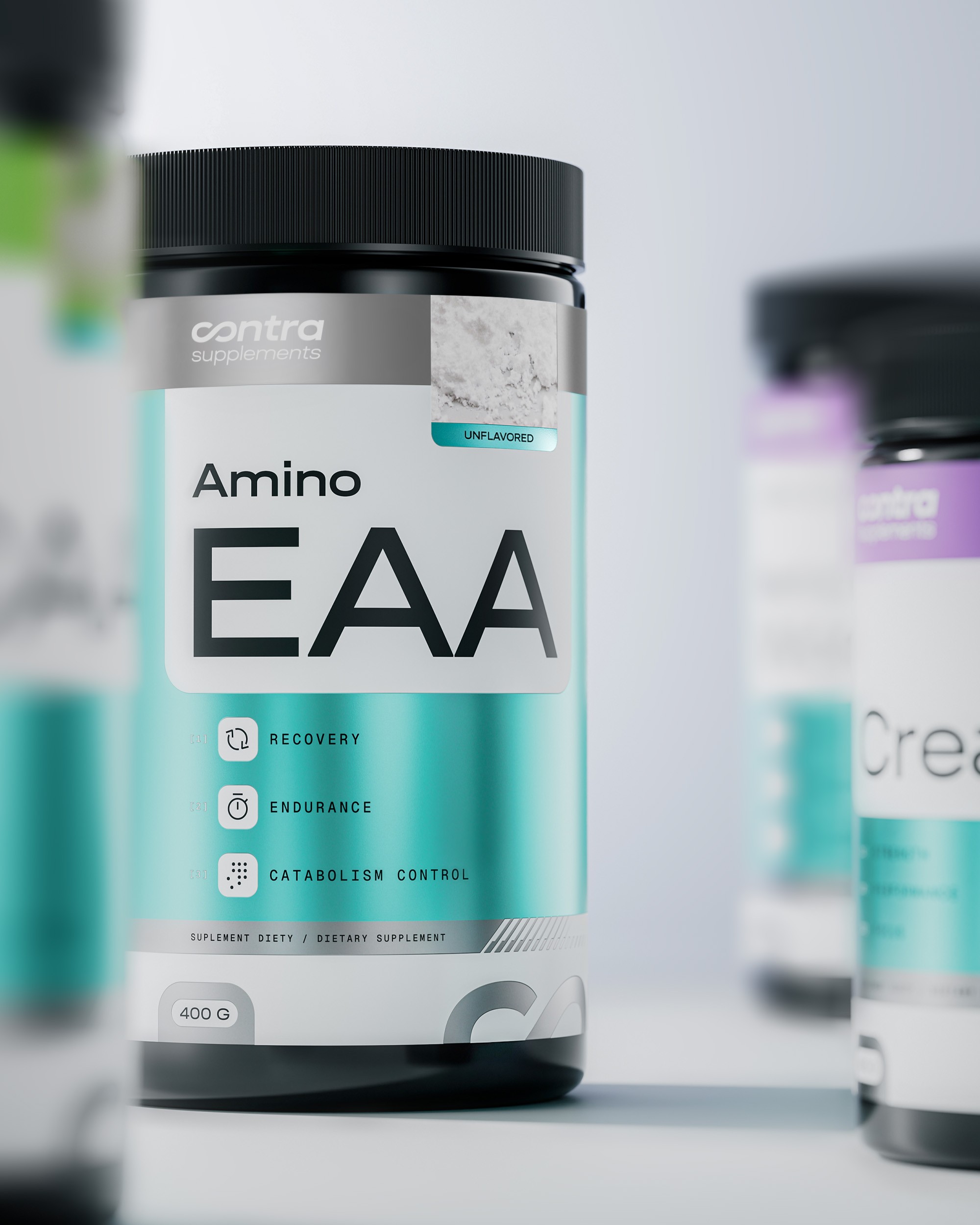
[ WORK IN PROGRESS ] Context: The brand was created to reach a broader audience than traditional sports nutrition, speaking equally to active people and those looking to support healthier daily routines. Outcome: We are in the process of designing a system that could scale across an extensive product range while breaking away from the familiar bodybuilding-only aesthetic. Team: Graphic design, motion design: Dawid Koruszowic 3D renderings: Oliwier Sowa Project management: Karolina Studzińska

01 / LOGO
02 / PACKAGING

03 / OOH

04 / MERCH

05 / PACKAGING
06 / PRODUCT CATALOGUE

07 / OOH
08 / SOCIAL MEDIA
Contra
,
Identity
,
2026
[ WORK IN PROGRESS ] Context: The brand was created to reach a broader audience than traditional sports nutrition, speaking equally to active people and those looking to support healthier daily routines. Outcome: We are in the process of designing a system that could scale across an extensive product range while breaking away from the familiar bodybuilding-only aesthetic. Team: Graphic design, motion design: Dawid Koruszowic 3D renderings: Oliwier Sowa Project management: Karolina Studzińska
01 / LOGO
02 / PACKAGING
03 / OOH
04 / MERCH
05 / PACKAGING
06 / PRODUCT CATALOGUE
07 / OOH
08 / SOCIAL MEDIA
FullMoon
,
Identity
,
2025
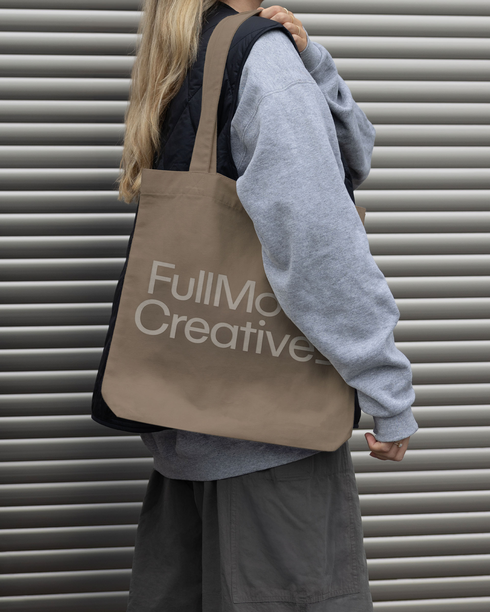
Context: Full Moon Creatives specialize in influencer marketing, content production and communication for beauty, fashion and lifestyle brands. The challenge was to create an identity that could showcase campaigns and personalities without competing for attention itself, while remaining flexible across a growing portfolio of visual content. Outcome: Not every influencer is self-centered, but every one of them wants to be the centre of attention. Translating that into a typographic visual system that avoids imposing hierarchy, we created identity that remains distinctive while always leaving the spotlight to the people in front of the camera. Team: Creative direction: Mikołaj Hałabuda Art direction, graphic design: Dawid Koruszowic, Mikołaj Hałabuda Motion design: Dawid Koruszowic
01 / SIGN
02 / MERCH
03 / LOGO

04 / OOH

05 / COLORS

06 / SOCIAL MEDIA

07 / OOH
08 / TYPOGRAPHIC SYSTEM

09 / OOH
10 / DECK LAYOUT

11 / BAG
12 / WEBSITE MOBILE
FullMoon
,
Identity
,
2025
Context: Full Moon Creatives specialize in influencer marketing, content production and communication for beauty, fashion and lifestyle brands. The challenge was to create an identity that could showcase campaigns and personalities without competing for attention itself, while remaining flexible across a growing portfolio of visual content. Outcome: Not every influencer is self-centered, but every one of them wants to be the centre of attention. Translating that into a typographic visual system that avoids imposing hierarchy, we created identity that remains distinctive while always leaving the spotlight to the people in front of the camera. Team: Creative direction: Mikołaj Hałabuda Art direction, graphic design: Dawid Koruszowic, Mikołaj Hałabuda Motion design: Dawid Koruszowic
01 / SIGN
02 / MERCH
03 / LOGO
04 / OOH
05 / COLORS
06 / SOCIAL MEDIA
07 / OOH
08 / TYPOGRAPHIC SYSTEM
09 / OOH
10 / DECK LAYOUT
11 / BAG
12 / WEBSITE MOBILE
Mazurro
,
Identity
,
2022
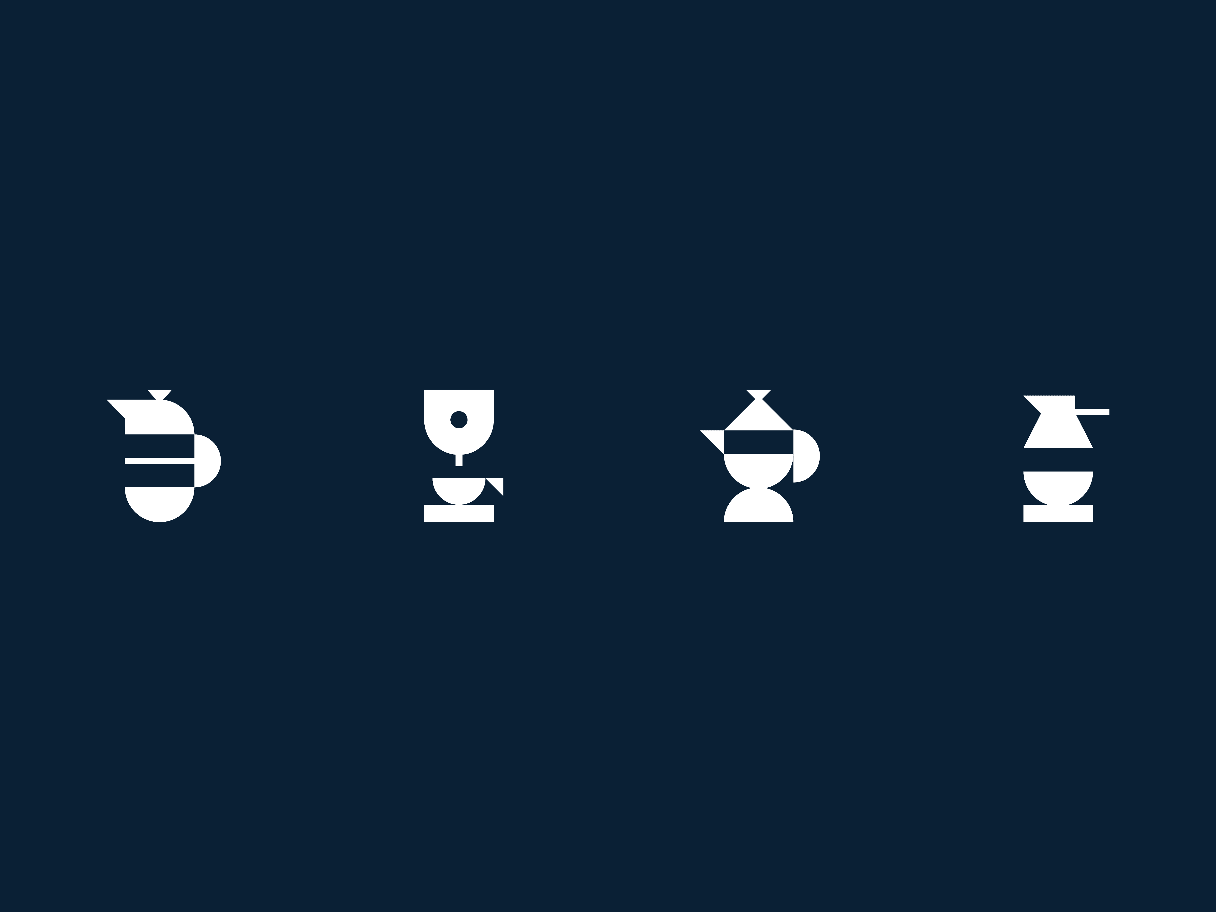
Context: The brand entered a highly saturated coffee market where most brands relied on familiar visual codes centred around craft, origin and lifestyle. Outcome: We built the brand around the culture of conversation, celebrating the moments of dialogue that happen over a cup of coffee. Table tennis became a visual metaphor for a conversation in a fashion-inspired campaign. Team: Creative direction: Paweł Mikołajec Graphic design: Dawid Koruszowic, Paweł Mikołajec, Paweł Chwedczuk Brand strategy: Radek Grzybowski UX/UI: Anna Kasza Account direction: Olga Grzybowska Project management: Weronika Parusel

01 / PACKAGING

02 / LOGO

03 / PHOTOSHOOT

04 / PHOTOSHOOT

05 / PACKAGING
06 / REEL
07 / ICONS

08 / PHOTOSHOOT
Mazurro
,
Identity
,
2022
Context: The brand entered a highly saturated coffee market where most brands relied on familiar visual codes centred around craft, origin and lifestyle. Outcome: We built the brand around the culture of conversation, celebrating the moments of dialogue that happen over a cup of coffee. Table tennis became a visual metaphor for a conversation in a fashion-inspired campaign. Team: Creative direction: Paweł Mikołajec Graphic design: Dawid Koruszowic, Paweł Mikołajec, Paweł Chwedczuk Brand strategy: Radek Grzybowski UX/UI: Anna Kasza Account direction: Olga Grzybowska Project management: Weronika Parusel
01 / PACKAGING
02 / LOGO
03 / PHOTOSHOOT
04 / PHOTOSHOOT
05 / PACKAGING
06 / REEL
07 / ICONS
08 / PHOTOSHOOT
Robson AI
,
Identity
,
2021
Context: Back in 2021, AI was still in its early days, but the technology was already rapidly advancing. Behind every model stood thousands of human contributions. Robson connected companies developing AI with people who completed paid microtasks that became training data for machine learning models. Outcome: We created a playful, human-centred identity that challenged the cold, technical image typically associated with tech companies. By shifting the focus from algorithms to human contribution, the brand presents AI training as a collaborative effort rather than a technological one. Team: Art direction, graphic design, motion design: Dawid Koruszowic Creative direction: Paweł Mikołajec UX/UI: Anna Kasza, Daniel Sowa, Sara Wicher Project management: Weronika Parusel

01 / LOGO
02 / ICONS

03 / DIGITAL

04 / OOH

05 / PHOTO ASSETS
06 / TAGLINE

07 / WEBSITE

08 / COLORS
Robson AI
,
Identity
,
2021
Context: Back in 2021, AI was still in its early days, but the technology was already rapidly advancing. Behind every model stood thousands of human contributions. Robson connected companies developing AI with people who completed paid microtasks that became training data for machine learning models. Outcome: We created a playful, human-centred identity that challenged the cold, technical image typically associated with tech companies. By shifting the focus from algorithms to human contribution, the brand presents AI training as a collaborative effort rather than a technological one. Team: Art direction, graphic design, motion design: Dawid Koruszowic Creative direction: Paweł Mikołajec UX/UI: Anna Kasza, Daniel Sowa, Sara Wicher Project management: Weronika Parusel
01 / LOGO
02 / ICONS
03 / DIGITAL
04 / OOH
05 / PHOTO ASSETS
06 / TAGLINE
07 / WEBSITE
08 / COLORS